


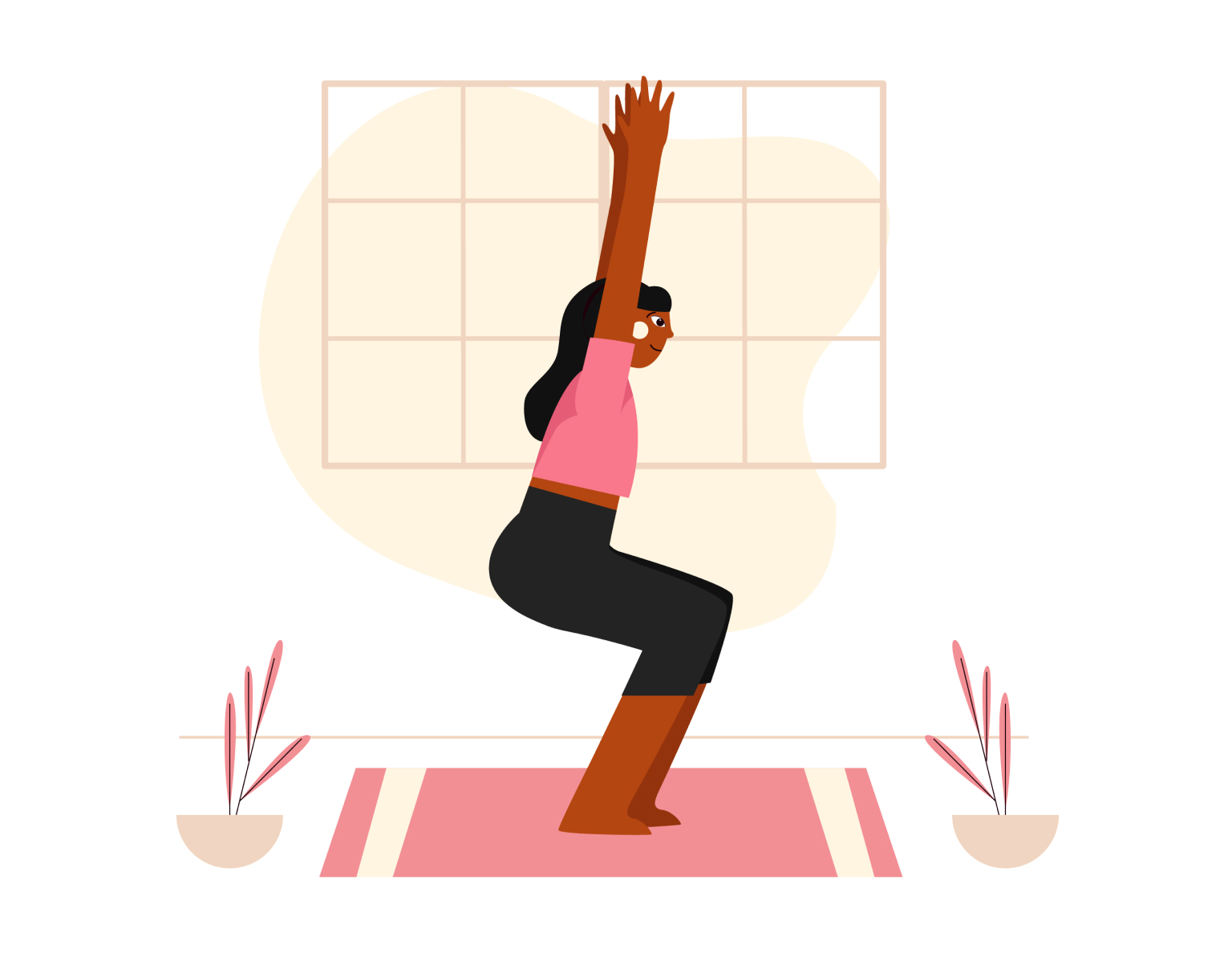
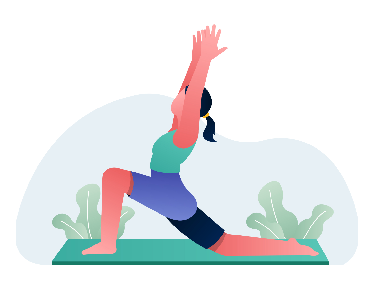
Warrior II
-
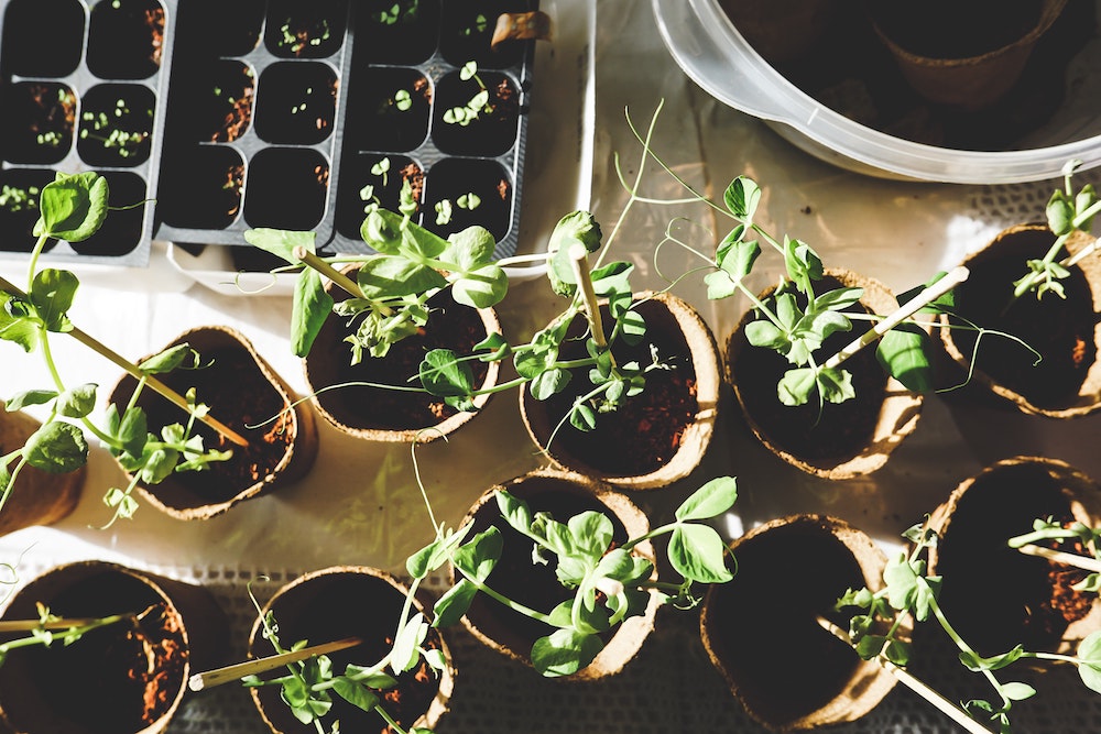
What's green, grows in the garden, and can sing?
Hover for the answer.
-

We wanted to have a dad joke here but couldn't find a good one.
They were all a-parent.
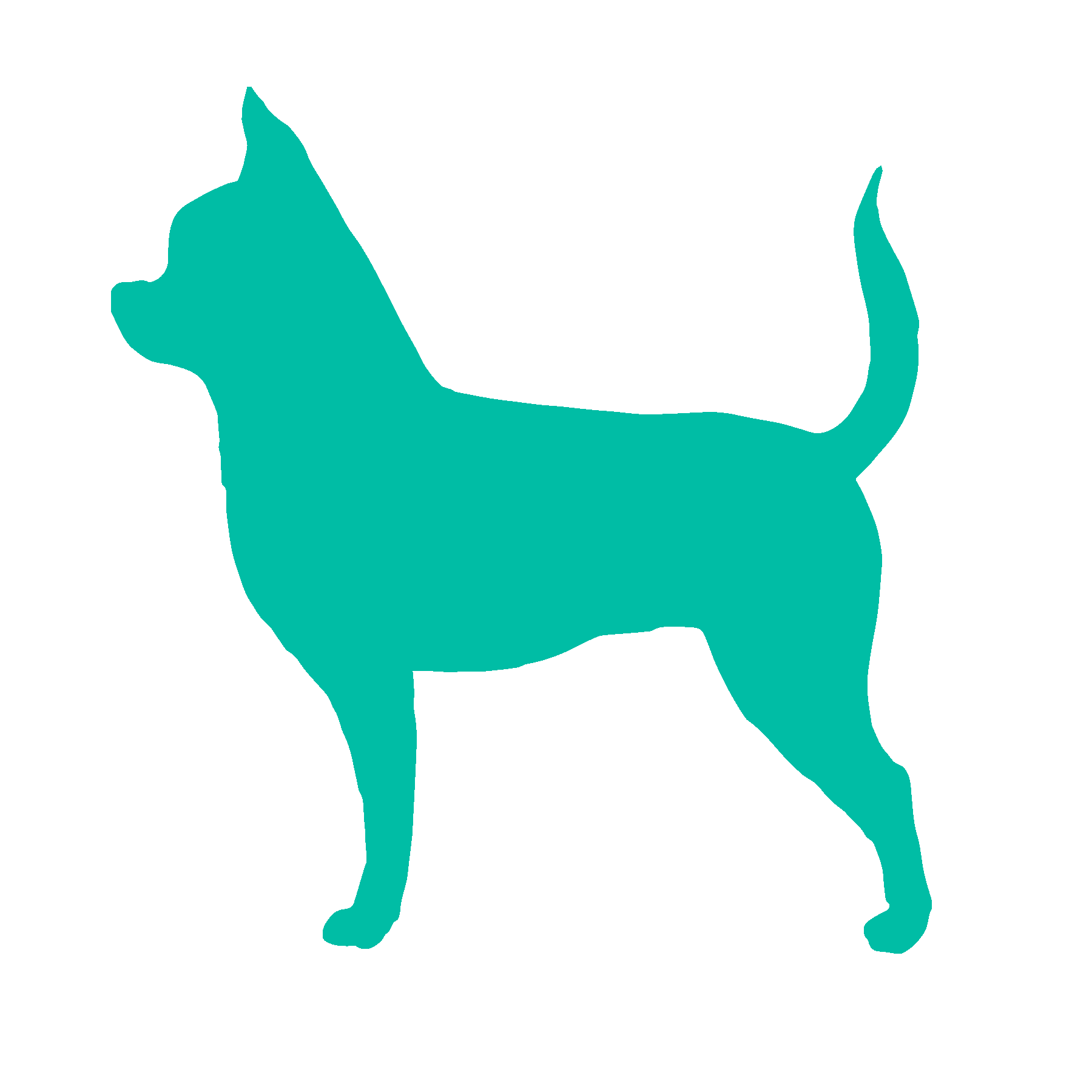
Chihuahua
Intelligent and loyal
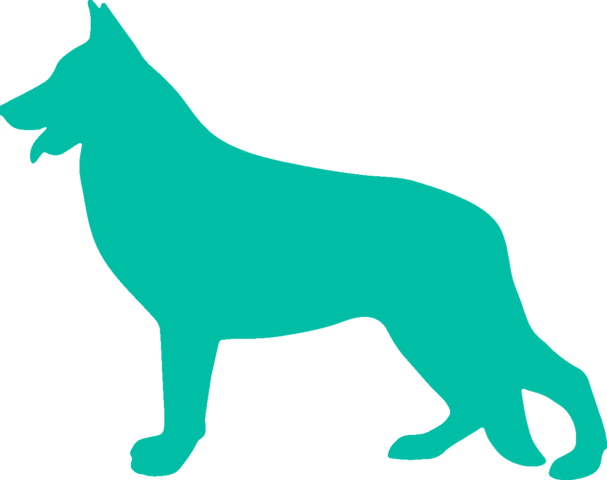
German Shepherd
Confident and courageous
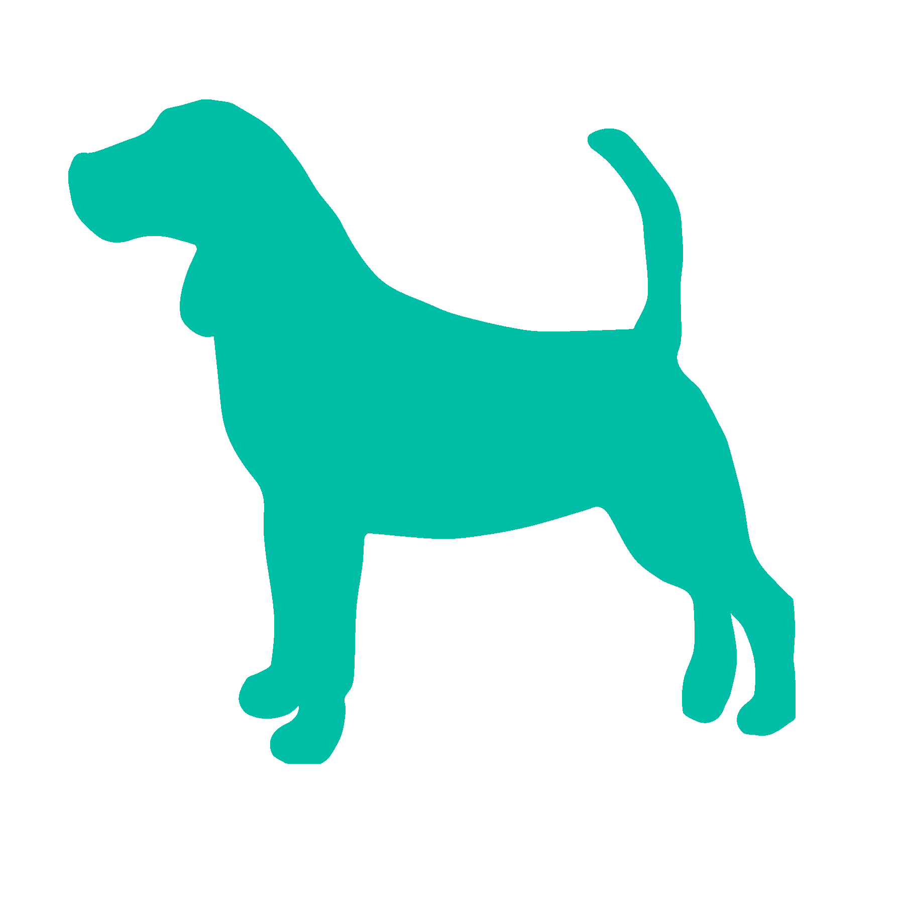
Beagle
Gentle and sweet
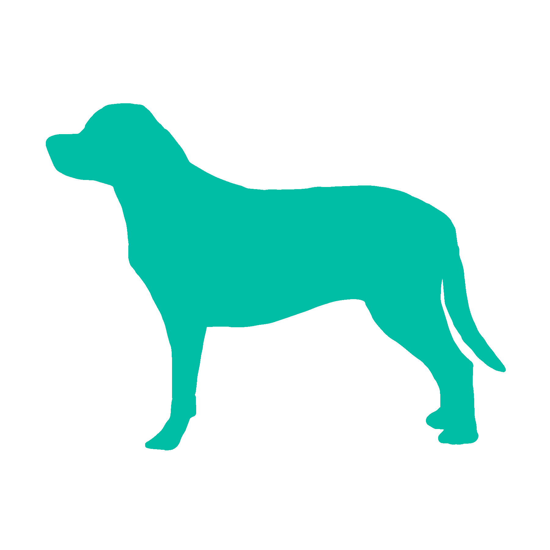
Labrador Retriever
Friendly and outgoing
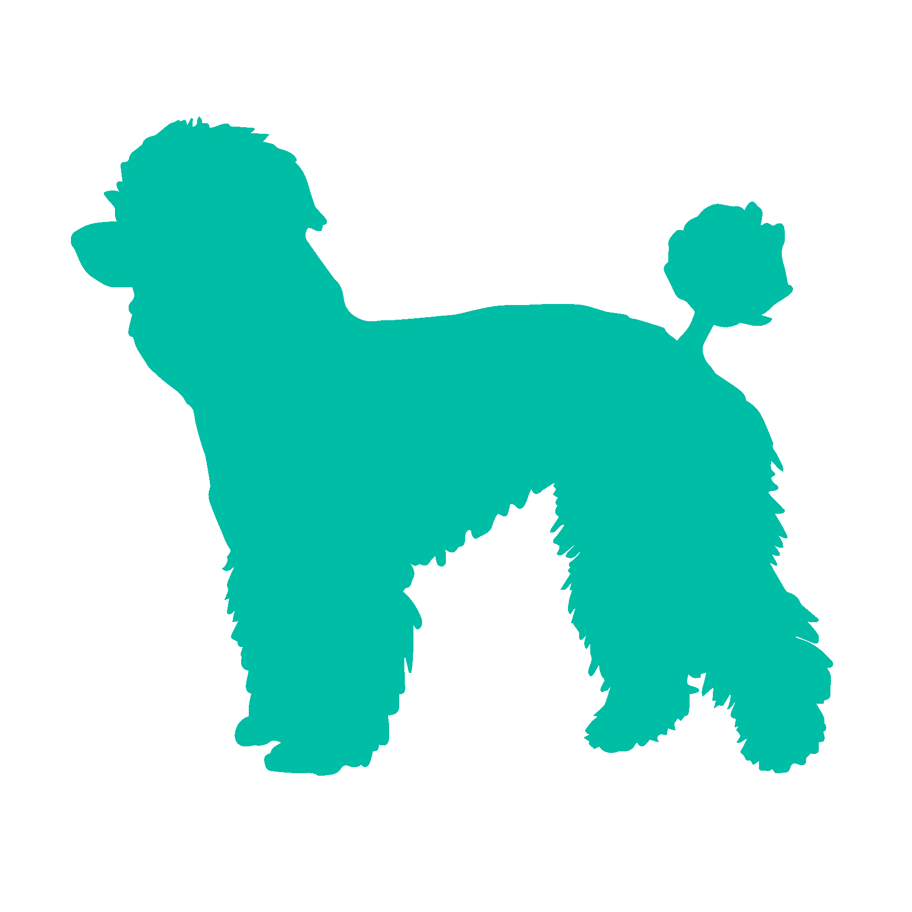
Poodle
Smart and agile


Hey Jude, don't make it bad take a sad song and make it better. Remember to let her into your heart, then you can start to make it better. Hey Jude, don't be afraid, you were made to go out and get her, the minute you let her under your skin, then you begin to make it better
Don't stop believin' Hold on to that feelin' Streetlights, people Don't stop believin' Hold on Streetlights, people Don't stop believin' Hold on to that feelin' Streetlights, people
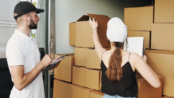
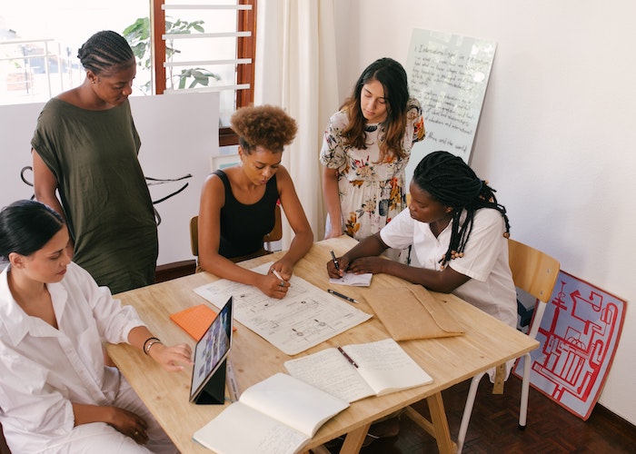
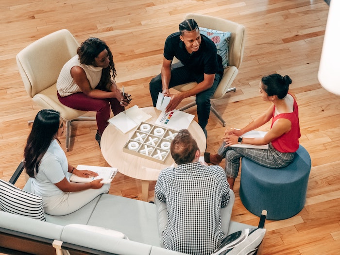
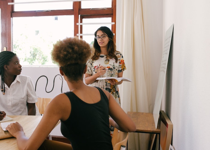
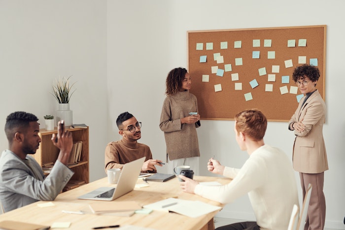
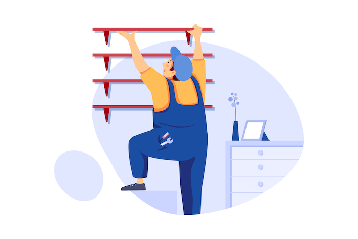
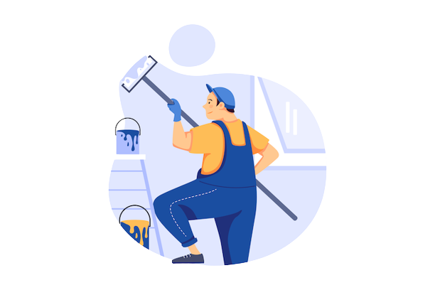
Components
Layout
Style
- Title
- Description: can be rich text or split between image and text.
- Orientation: Choose between having vertical or horizontal tabs.
- Tab Content Layout: Choose between having text only or text and an image inside each tab.
- Full-Width Tab: When turned on, the tabs will take up the width of the entire page.
- Active Tab Background Color: Choose the background color of the active tab.
- Active Tab Highlight Color: Choose the color of the line underlining the active tab’s title.
- Inactive Tab Background Color: Choose the background color of the inactive tab(s).
- Inactive Tab Highlight Color: Choose the color of the line underlining the inactive tab’s title.
- Customize Tabs Font: Option to customize the font of the inactive tab(s).
- Customize Active Tabs Font: Option to customize the font of the active tab(s).

Laura Ona
Role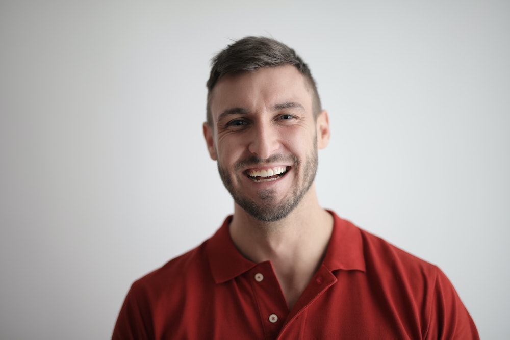
Edwin Day
Role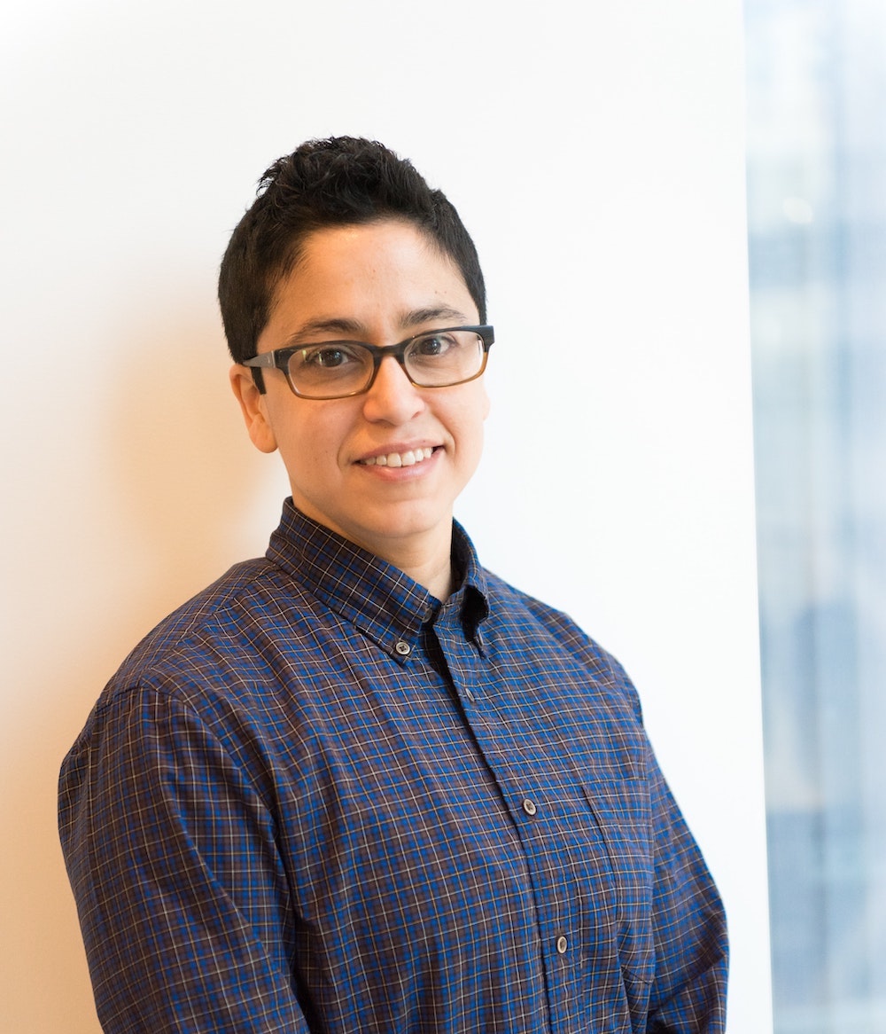
Alix Dany
Role
Isa Shams
RoleSnooze alarm 4 times, but eventually get up by 6:40.

6:41 - 7:00 AM
Internal Debate
Do I really need to do this? Should I just call in sick? I can have someone else do my work for me.
Finally convince myself that I need to do this, and start getting dressed.
7:17 AM
Morning run
Not because I'm athletic, but because I'm about to miss the train.
